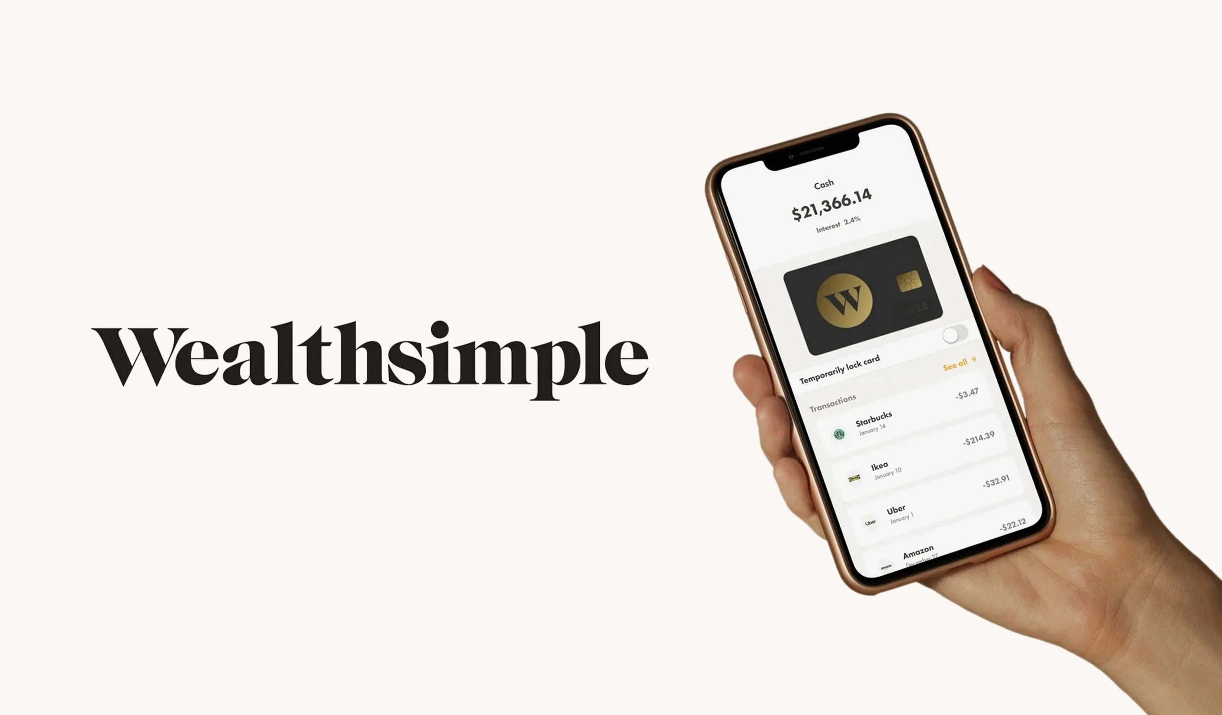
Redesigning cash onboarding at Wealthsimple
Context The Cash account is Wealthsimple’s response to a traditional bank checking account. Over the past 2+ years, the account went from a standalone P2P app to one of the best checking accounts in Canada.
Challenge Many features have been introduced to clients but accustomed to traditional banks, they were still unaware of all that the Cash account had to offer. We wanted to improve the way we surface these features and onboard clients into cash so they have all knowledge and tools needed to make it their primary bank account.
Contribution I expanded our initial focus on a single breather screen to include spendable, non-spendable, and joint accounts. I saw the need for alignment across these screens to ensure a cohesive user experience, so I proposed a unified content strategy that would keep the design patterns, content structure, and tone consistent while still allowing for unique messaging specific to each account.
To bring clarity to our value propositions, I organized the information architecture, introducing a hierarchy that made it easy for users to grasp the benefits at a glance. At the screen level, I crafted introductory descriptions that framed each account’s unique value, setting a clear context for users right from the start.
For the bulleted lists, I focused on a user-centered approach by highlighting the benefits instead of just listing features. I used a conversational tone to communicate directly with the user, making each point relevant and engaging. In contrast, I designed the carousel section with a more transactional tone to zero in on key account features, allowing users to quickly assess specific functionalities.
Deliverables I worked closely with the product designer to deliver improved cash onboarding breather screens and a new “Get started with Cash” carousel that appreas on the dashboard when a client opens their first cash account.
Impact Overall uplift in conversion, more clients finding more features. The product team gained valuable insights on which features clients had been struggling to find, for example open multiple cash accounts were the most completed action despite it being 3rd in the carousel. This told us that clients had been looking for how to achieve this action and that our flow significantly improved the experience leading to more cash accounts opened.
Role Staff Content Designer | Company Wealthsimple, fintech | Collaborators Product Designer

